
54th Mile
WEB DESIGN | WEB DEVELOPMENT
PROJECT OVERVIEW
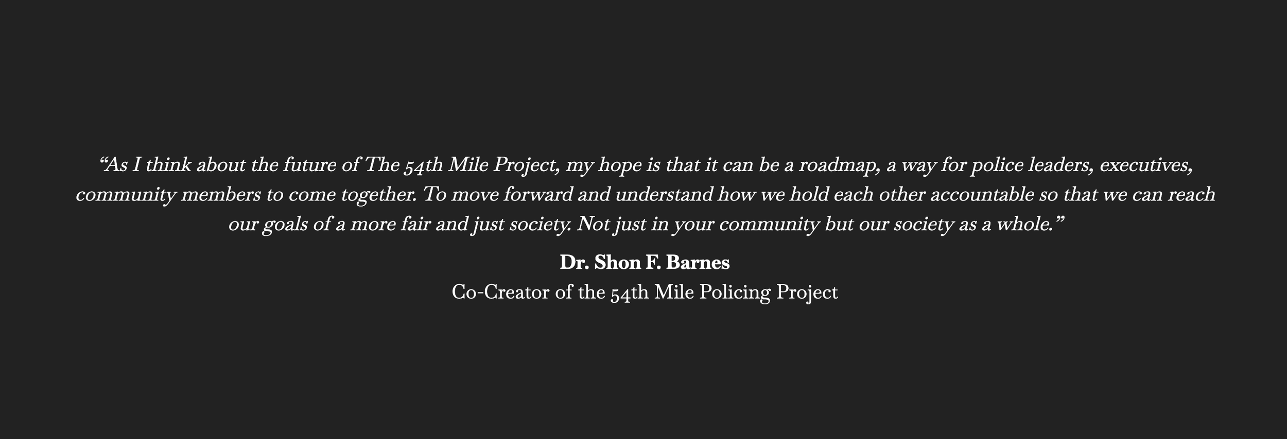
The 54th Mile Policing Project is a national initiative created to build and enhance relationships between police officers and the communities they serve. Its name comes from the historic civil rights march between Selma and Montgomery, Alabama. A 54-mile walk three law enforcement leaders retraced in 2020 as an act of solidarity and public commitment.
OBJECTIVE
Build a platform that reads as credible within law enforcement circles without reading as closed to everyone else
Create a visual system capable of holding the weight of civil rights history without flattening it into decoration
Design a website that converts awareness into participation: Steering Committee membership, training enrollment, program sign-up
DESIGN CHALLENGE
The project required two things that rarely share the same design language: institutional authority and genuine openness. A design weighted too far toward one would fail the other. Law enforcement partners needed to see professional legitimacy. Community members needed to feel addressed, not managed.
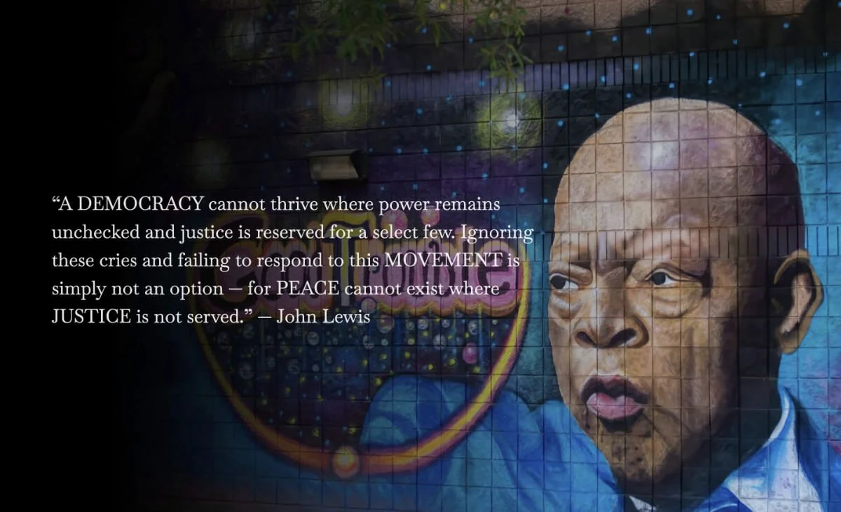
There was also the question of the historical material. The 54-mile march is not a metaphor to deploy casually. Bloody Sunday, the Edmund Pettus Bridge, Jimmie Lee Jackson — the context the project draws from carries its own authority. The design's responsibility was to honor that weight, not compete with it.
Typography
Oswald sets the tone. A condensed grotesque with strong visual presence, it commands attention without reading as bureaucratic. For a project asking law enforcement and community members to confront a shared history and consider a different future together, the headline register needed to hold. Not persuade, not charm. Hold.
Baskerville provides the counterweight. One of the most historically significant typefaces in Western printing, it carries credibility through substance rather than volume. In body copy, it slows the reader down. It establishes the kind of authority earned through seriousness, not declaration.
Together, the pairing enacts the project's premise: urgency grounded in weight.
Visual Language
The palette is built around contrast and restraint. Deep blue and near-black backgrounds establish gravity. White type carries the message cleanly. The typography does most of the visual work, which is appropriate when the subject matter is already doing its own.
Civil rights photography and archival imagery are treated with care. The design frames rather than directs. Layout provides structure; white space provides room for the material to register.
WEBSITE DESIGN
The site is organized across three pages, each with a single purpose: understand the mission, meet the people behind it, then consider how to be involved.
Home establishes the initiative, the historical parallel, the national goals, the organizational foundation. Our Story carries the civil rights context and the co-creators' walk in full. Meet Our Team introduces the co-founders and the Steering Committee assembled to drive the work forward. The navigation sequence is deliberate: credibility before biography, biography before invitation.
OUTCOME
The result is a platform capable of operating at the intersection of law enforcement and community trust. Two registers that rarely share the same visual space, let alone the same mission.
The work matters beyond the brief. This was a project about what policing can become when those doing it and those affected by it are willing to build something together. Design doesn't close that distance. It establishes the ground the conversation starts from.