§ PROJECT · BRAND IDENTITY & STRATEGY | WEB DESIGN
Emily Salisbury.
ENGAGEMENT
Identity & Strategy, Web Design
YEAR
2025
ROLE
Design, Lead
Agency Engagement
LEAD TIME
8 Weeks
SECTOR
Social Impact · Public Affairs
CLIENT
Emily Salisbury
§ 01
Project overview.
Emily Salisbury is an internationally recognized criminologist, public speaker, and consultant working at the intersection of research, policy, and justice reform. Her work focuses on improving outcomes for justice-involved women through gender-responsive strategies and evidence-based practices used by agencies around the world.
The project focused on creating a cohesive brand identity and digital platform capable of communicating both the academic depth of Emily’s research and the real-world impact of her initiatives.
§ 02
Objective.
Define a cohesive visual language—including typography, logo application, and a restrained color palette—that balances academic credibility with a modern, human-centered approach to justice reform.
Synthesize and organize a vast, multi-faceted catalog of research, publications, and media appearances into an intuitive navigation framework tailored for busy policymakers and practitioners.
Design an approachable, highly readable digital interface using strategic visual pacing, generous spacing, and clear data hierarchy to make dense, technical subject matter easily digestible.
§ 03
Design challenge.
Balancing authority and accessibility
The identity needed to communicate academic credibility while remaining approachable to practitioners and policymakers.
Presenting complex subject matter
Research frameworks and methodologies had to be organized in a way that felt clear and navigable.
Avoiding institutional aesthetics
Justice-related branding often feels bureaucratic. The visual language needed to feel professional yet human-centered.
§ 04
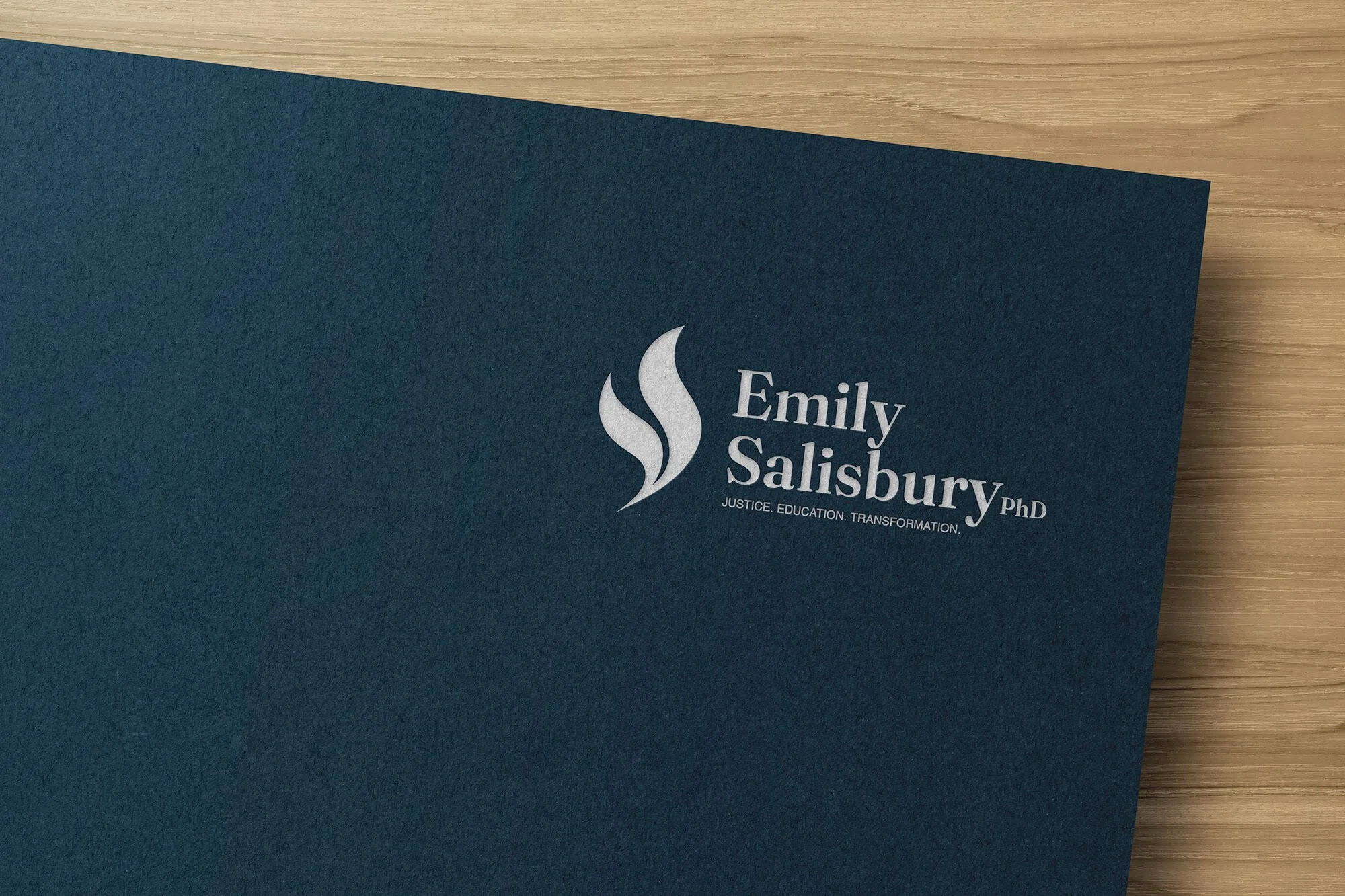
Identity & wordmark.
The brand identity was developed to reflect the dual nature of Emily’s approach: rigorous academic research combined with human-centered justice reform. The visual system needed to communicate credibility and expertise while remaining accessible and contemporary.
Rather than adopting the institutional tone often associated with criminal justice organizations, the identity was positioned to feel thoughtful, structured, and quietly confident, supporting the seriousness of the subject matter without appearing bureaucratic or impersonal.

§ 05
Typography.
DISPLAY · HEADLINES

A refined serif typeface anchors the identity, referencing the visual language of academic publishing and scholarly institutions. Serif typography carries strong psychological associations with trust, credibility, and authority, making it well suited for communicating research-driven work and professional expertise.
TEXT · BODY

To balance this formality, a modern sans-serif typeface was introduced for interface elements and supporting content. This pairing creates a clear typographic hierarchy while improving legibility across digital layouts and long-form reading.
§ 06
Color palette.
The restrained, muted color palette uses natural hues to convey professionalism, trust, and calm authority. By replacing stark, institutional tones with warmer colors, the design introduces a sense of balance and humanity that aligns with Emily’s reform-focused work. Accent colors are used sparingly to strategically guide user attention, ensuring the overall experience remains calm, readable, and focused.
§ 07
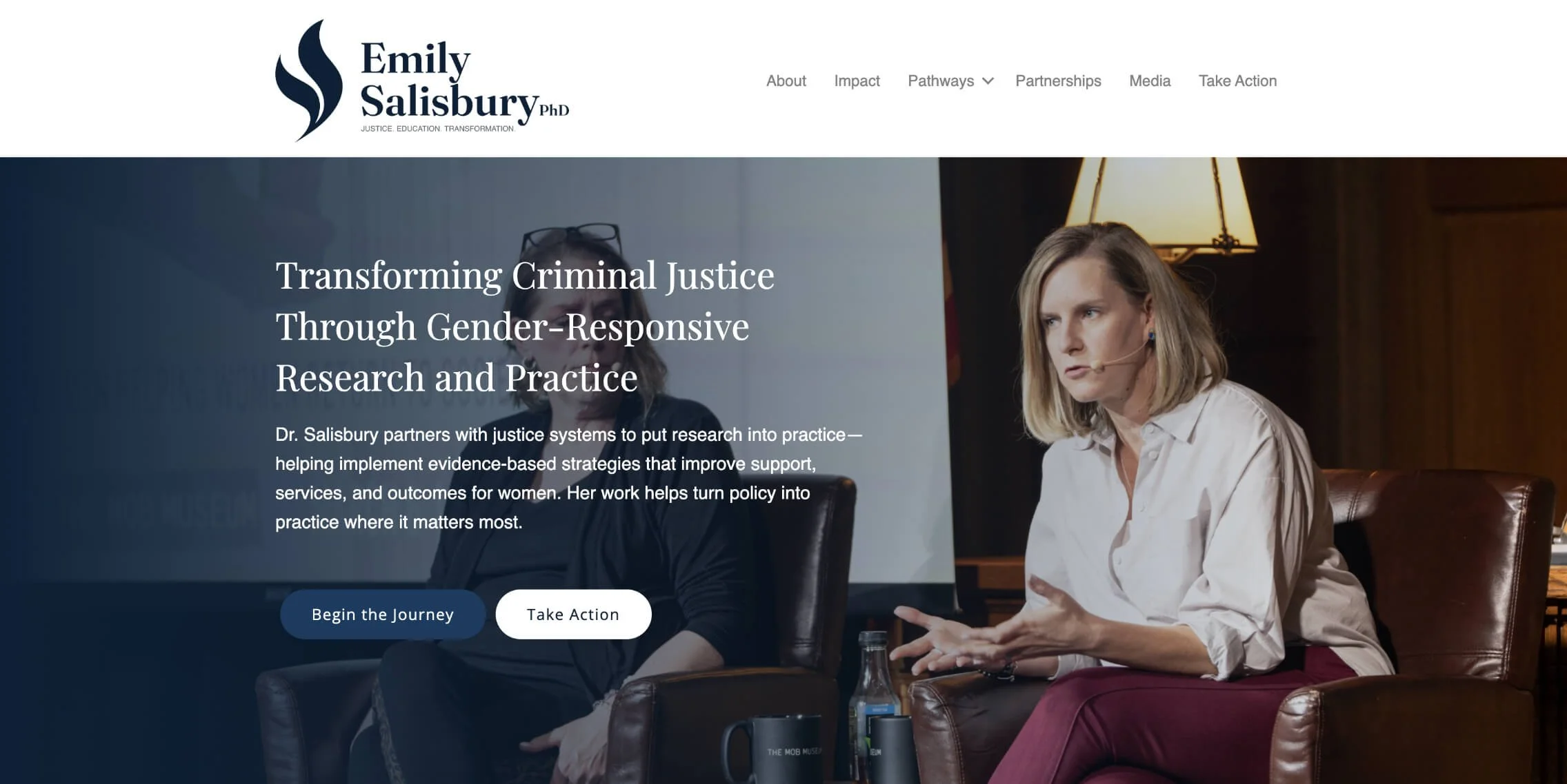
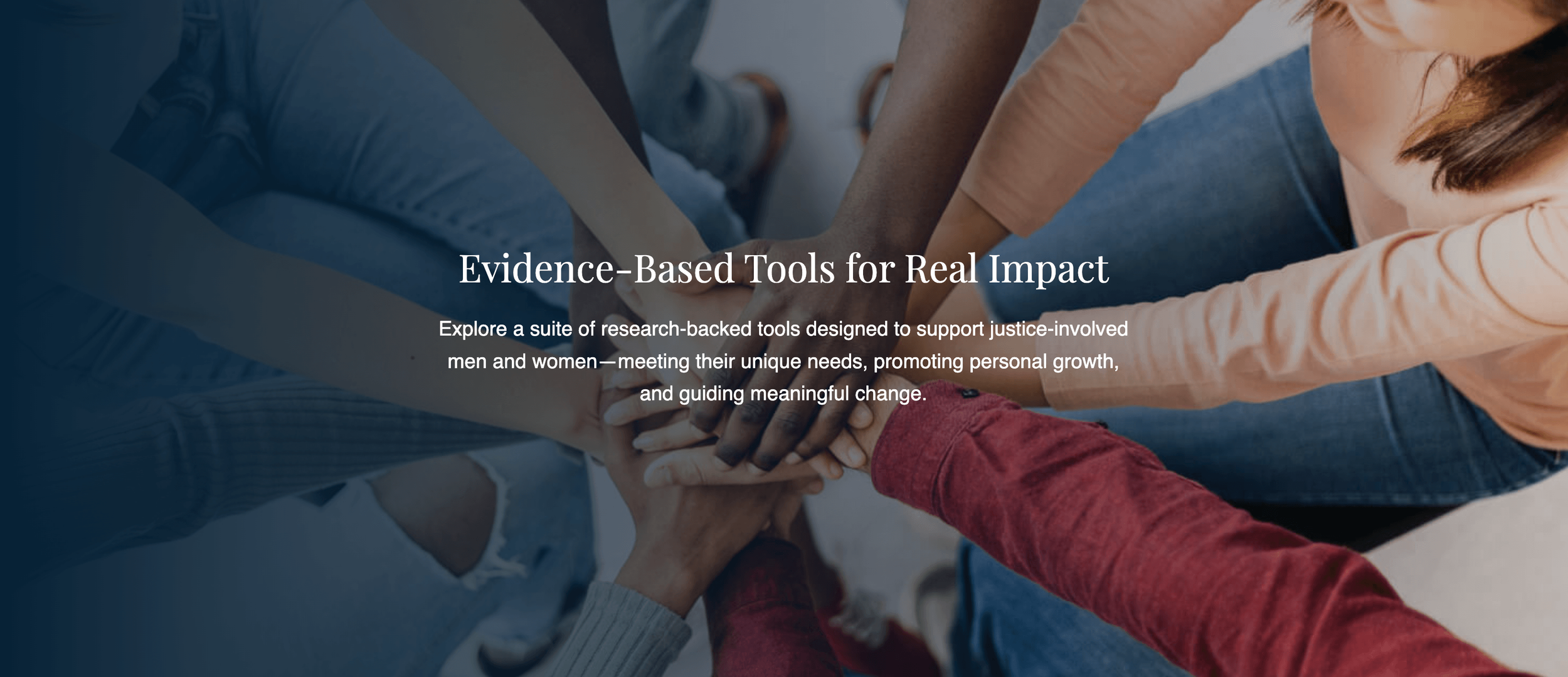
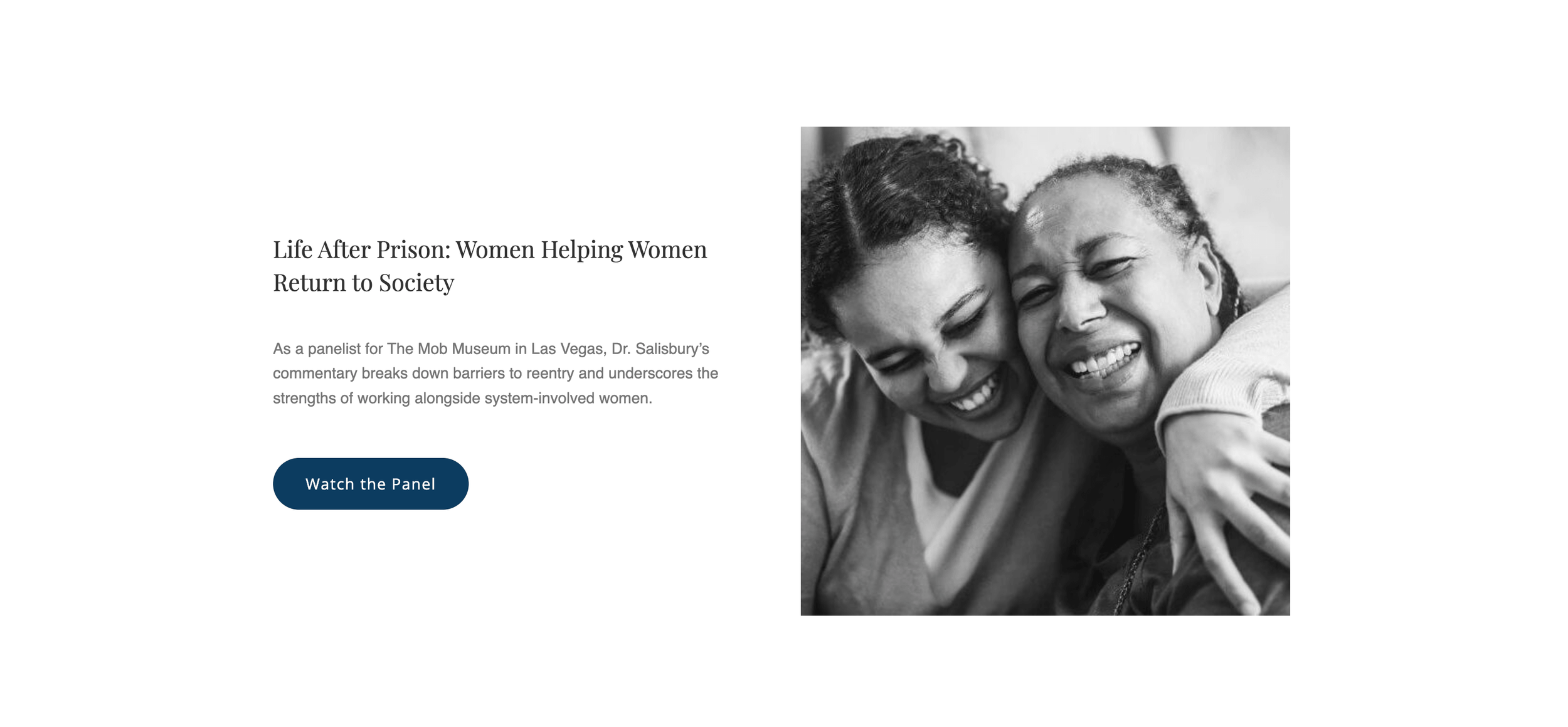
The built site.
The website translates the brand identity into a clear, structured digital experience designed for easy navigation across a broad range of content, including research, publications, and media appearances. By organizing content around the key areas of Emily’s work, the layout highlights both the scope and practical impact of her initiatives. Generous spacing, strong typographic hierarchy, and calm visual pacing make dense, complex subject matter approachable and readable. Ultimately, the site communicates expertise and professionalism, ensuring high accessibility for policymakers, researchers, and justice system practitioners.
§ 07 - OUTCOME
What it became.
The final identity and website establish a cohesive professional presence that clearly communicates the scope and impact of what Emily’s does.
The platform successfully presents complex research initiatives in an accessible format while reinforcing her position as a leading voice in gender-responsive justice reform. By combining a structured visual system with thoughtful information architecture, the project creates a digital presence that reflects both the intellectual depth and the human importance of the work.
The result is a scalable platform that can continue to grow alongside Emily’s research, collaborations, and public engagement.
§ RELATED
More work.
Elevated Ethos
IDENTITY & STRATEGY · WEB DESIGN

Roast & Toast
IDENTITY & STRATEGY

Nature with Nicola
IDENTITY & STRATEGY · WEB DESIGN
Have a project that needs this kind of care?
Send a note and we'll work through it together. You'll receive an honest read on whether the engagement is the right fit for what you're building.