§ PROJECT · BRAND IDENTITY & STRATEGY | WEB DESIGN
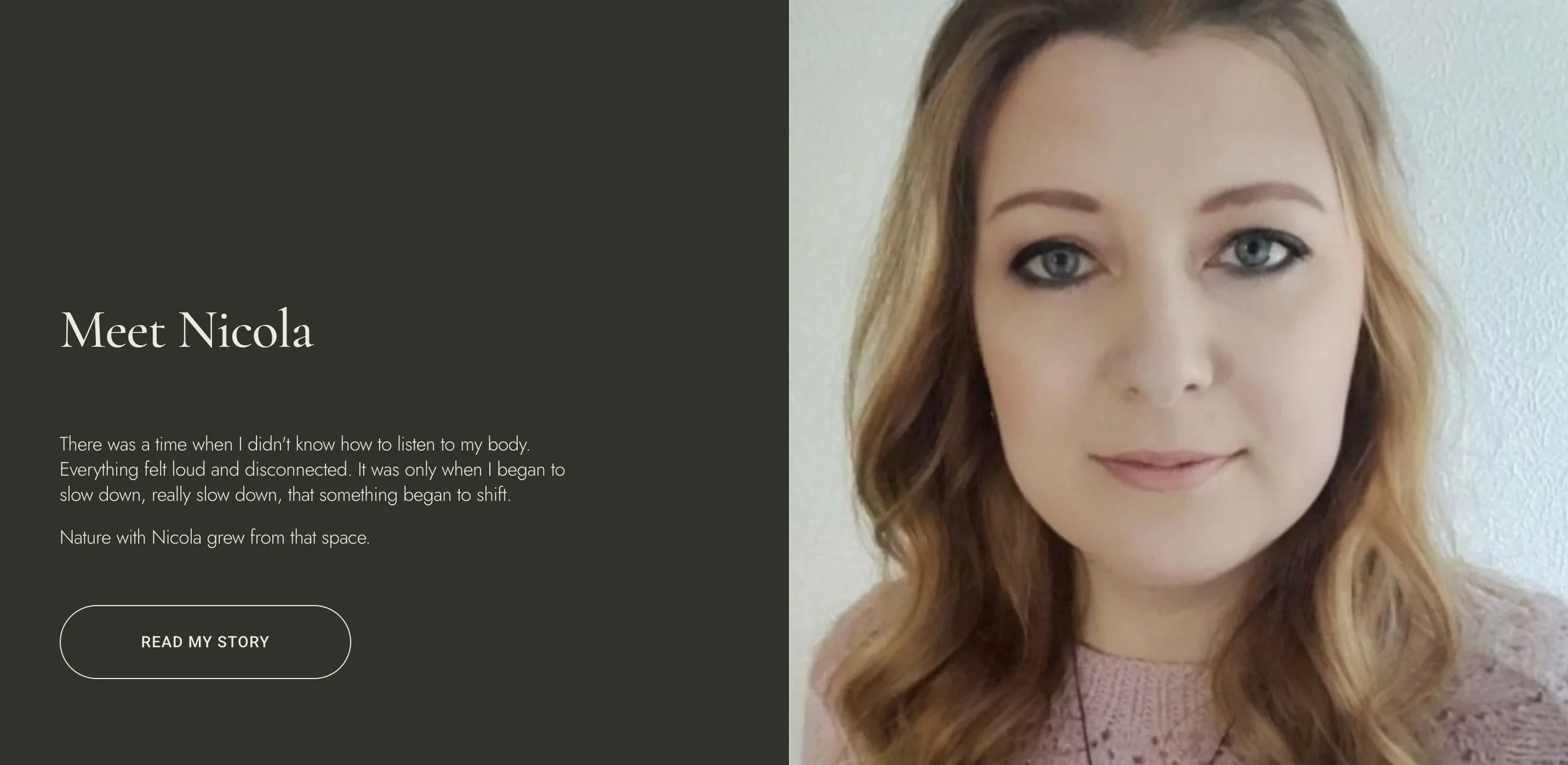
Nature with Nicola.
ENGAGEMENT
Identity & Strategy, Web Design
YEAR
2026
ROLE
Creative Director
LEAD TIME
4 Weeks
SECTOR
Alternative Healthcare
CLIENT
Nicola Sabin
§ 01
Project overview.
Nature with Nicola is a herbal medicine practice run by Nicola Sabin, an herbalist and published writer whose work brings together clinical herbalism, traditional plant energetics, and seasonal living. The practice required a complete brand foundation built from scratch — identity, voice, copy, photography direction, and a fully designed and developed website.
§ 02
Objective.
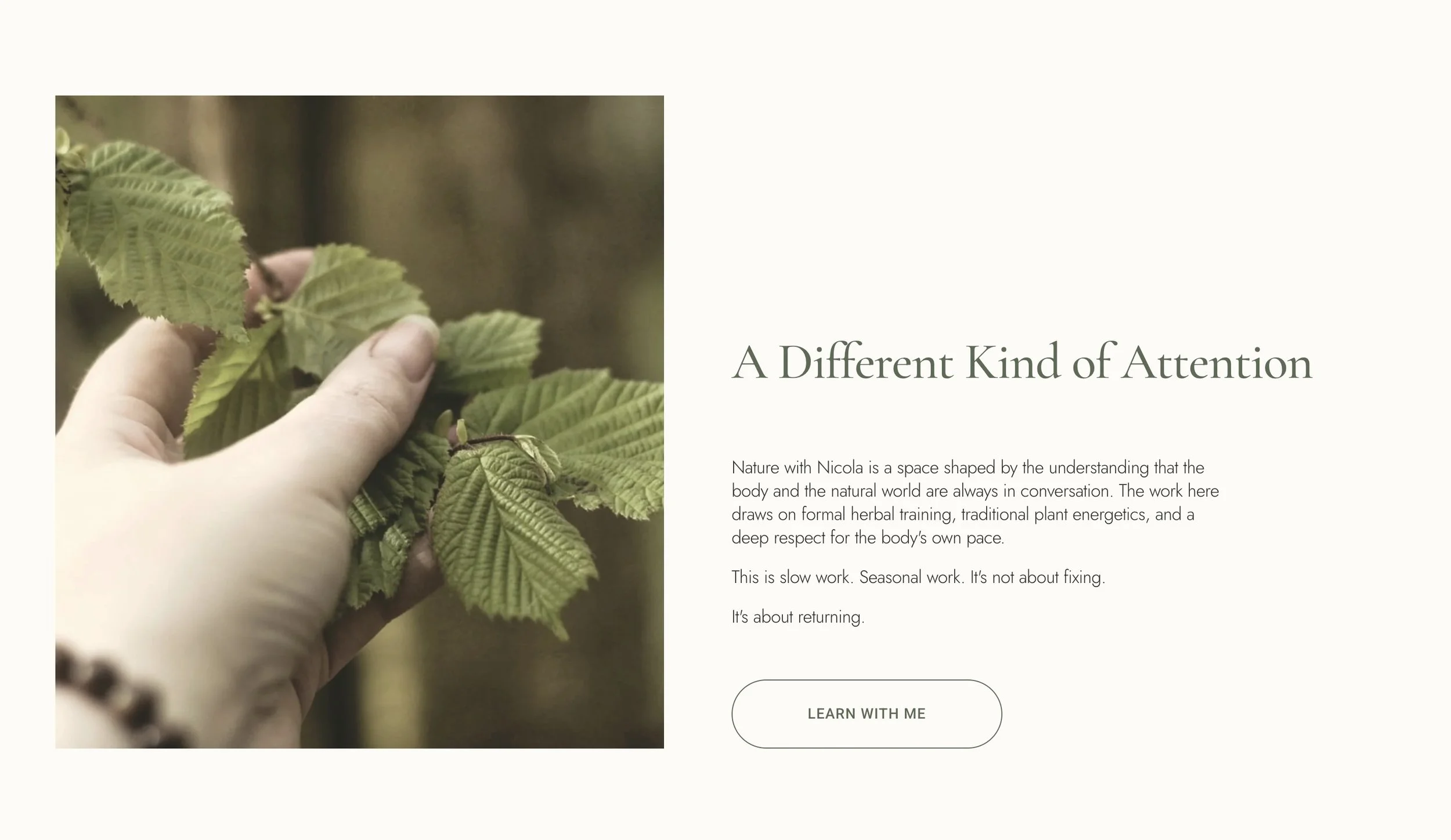
Position an herbal medicine practice as serious and literary — distinctly apart from mainstream wellness aesthetics, without becoming cold or clinical.
Capture Nicola's voice with enough fidelity that the site reads as her own writing, not ghostwritten by a brand consultant.
Calibrate site pacing to enact the brand's unhurried quality before any copy has to do that work, letting white space and rhythm carry the claim.
§ 03
Design challenge.
Distinguishing from wellness noise
The herbal medicine and natural health space is dense with superficial, aspirational content. The brand needed to signal something genuinely different, rooted, clinically rigorous, and literary, without being contrarian or cold. Every aesthetic decision had to resist the wellness visual language while remaining warm and accessible.
Building trust without institutional backing
As a solo practitioner with no clinic, no team, and no institutional backing, the brand had to carry the full weight of professional credibility on its own. Trust had to be built through the quality of the writing, the foundational credentials, and a visual environment that didn't need to shout.
Translating a literary voice into visual form
Nicola's writing is specific, unhurried, and deeply embodied. The visual identity couldn't simply illustrate these qualities, it had to embody them. Every spacing decision, image choice, typographic weight, and section rhythm had to serve the same feeling as the prose: a sense that there is no hurry here.
§ 04
Identity & wordmark.
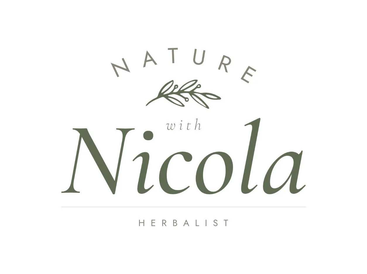
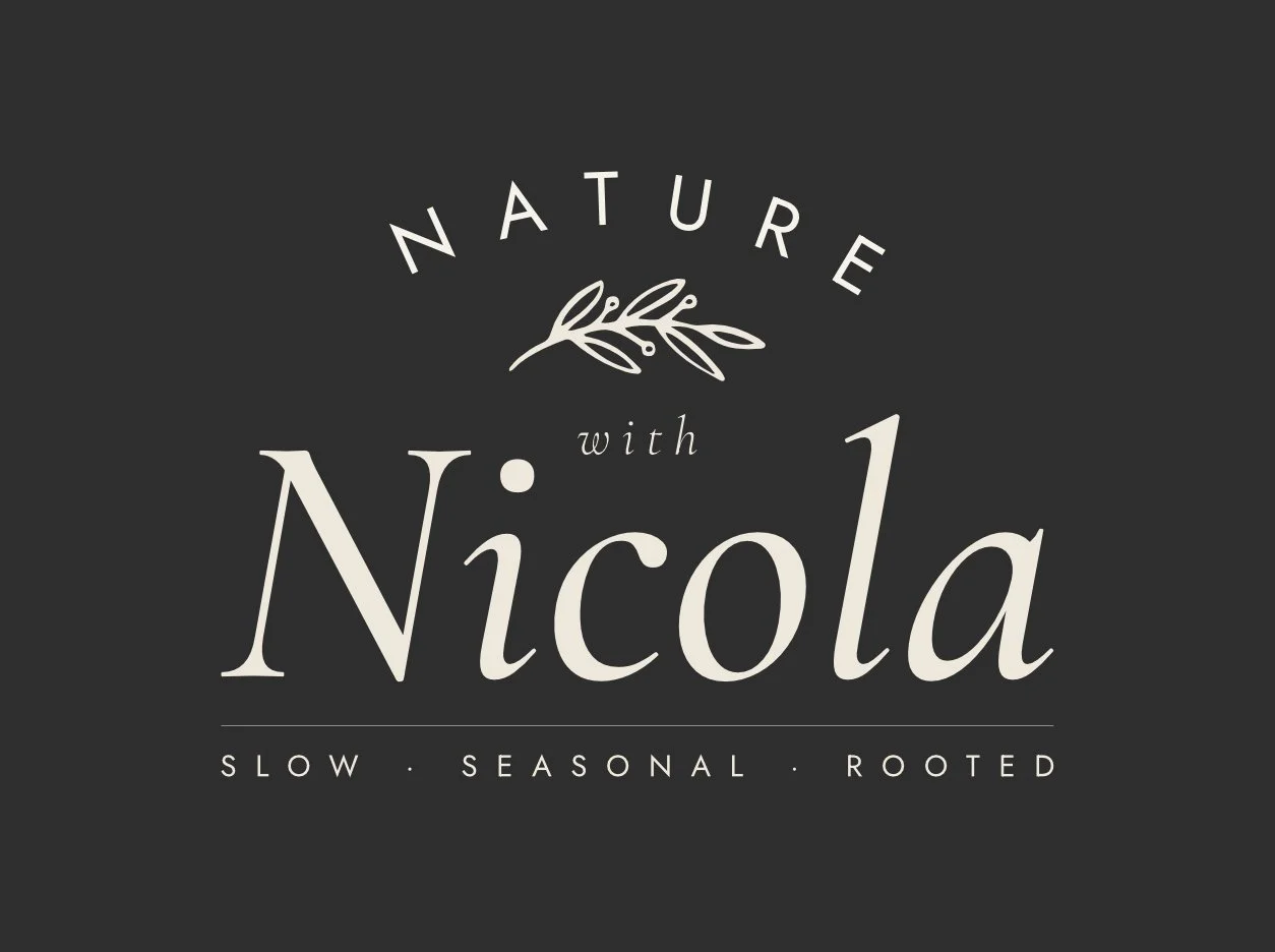
Built on the principle that the practitioner is the center, the logo features "Nicola" as the dominant element in a large, Moss-green italic serif. "Nature" frames the name from above in tracked uppercase, while a light "with" and an amber-toned "Herbalist" anchor the credential below without feeling institutional. At the core, an observed botanical illustration of a herb branch connects the natural world directly to the person. This hierarchy adapts to two configurations: a horizontal lockup for compact applications like navigation and small collateral, and a stacked lockup featuring an arched "Nature" for high-impact, large-scale displays.
§ 05
Typography.
DISPLAY · HEADLINES

Cormorant Garamond carries the headings, display text, and pull quotes and the name "Nicola" within the logo. Its fine strokes and organic curves bring the quality of early botanical illustration text to every heading: precise without stiffness, historical without period costume. At large sizes it creates stillness. That quality was the requirement.
TEXT · BODY

Jost handles the functional layer: body text, navigation, captions, labels. Set at light weight throughout, with generous line-height. It gives the prose room to breathe, the same instruction given to the layout and to the copy itself. The pairing works because both fonts move in the same direction. One through character. The other through restraint.
§ 06
Color palette.
The palette was drawn from the British landscape at the turn of the season. Muted greens, warm linens, earthy ambers, a single deep forest tone as anchor. No saturated hue. Nothing that signals effort. The primary register: Moss, Sage, Oat, Dust, Deep. These carry the visual weight of the brand across every page and application.
§ 07
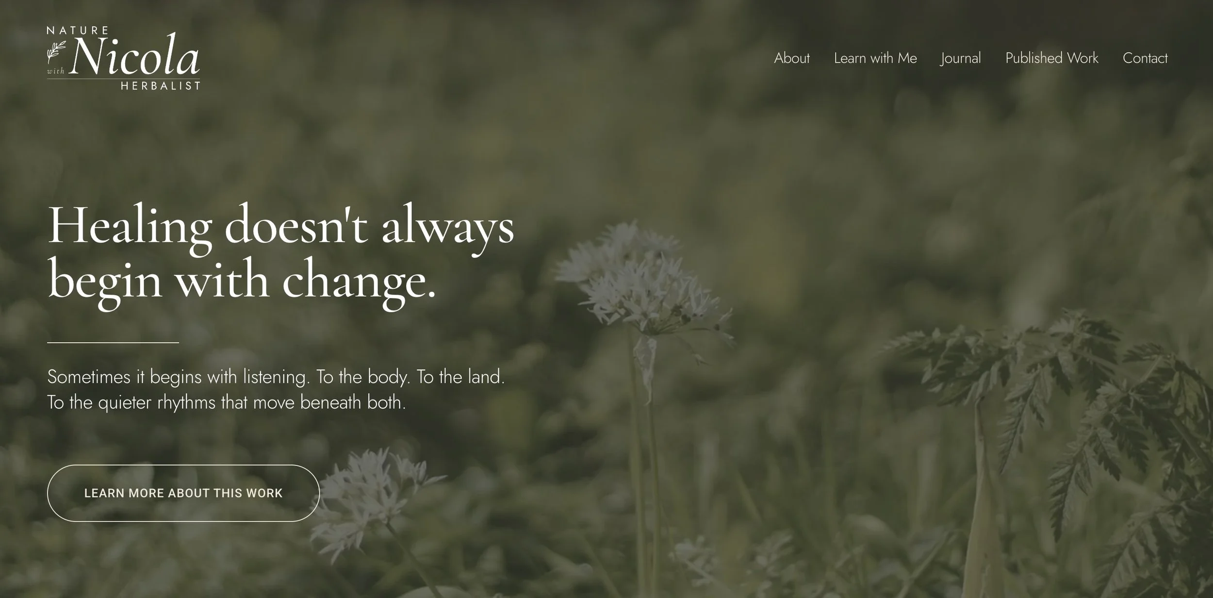
The built site.
The final site spans six pages: Home, About, Learn With Me, Journal, Published Work, and Contact, each with full custom copy written in Nicola's voice, and each designed within Squarespace 7.1's Fluid Engine for complete responsiveness across devices.
“I actually got emotional scrolling through it. Especially seeing my words held this way alongside the photographs. It feels real now. And the image choices are stunning. The tones, the pacing, the light — it all feels so gentle and intentional.”
— Nicola Sabin | Founder · Nature with Nicola. On delivery, May 2026
§ 08 - OUTCOME
What it became.
The project delivered a complete brand foundation for a practice that previously had minimal public presence. Every element was built from scratch: brand voice and style guides, site architecture and URL structure, detailed page layouts, six pages of original copy in Nicola's own voice, photography direction, and a fully built, populated, and published website.
The site successfully holds what the practice actually is: a serious, slow, literary herbal medicine practice, in a visual environment that earns that description at every level. Clinical rigor and personal warmth coexist without either diluting the other.
§ RELATED
More work.
Elevated Ethos
IDENTITY & STRATEGY · WEB DESIGN

Roast & Toast
IDENTITY & STRATEGY
Emily Salisbury
IDENTITY & STRATEGY · WEB DESIGN
Have a project that needs this kind of care?
Send a note and we'll work through it together. You'll receive an honest read on whether the engagement is the right fit for what you're building.